As is the way now, I came home a couple of days ago and Netflix had already picked my programming for the evening and at this point, who am I to disagree with the robots? The robots are controlling our shopping now and writing all of our papers. I mean a robot or ChatGPT could be writing this right now. You don’t know. It might be true. You might be impressed by shockingly good prose that it turns out is written by an AI thing. Thing. I don’t have a better term for it.
Well I hate to disappoint you, but it’s still me, writing from my undisclosed location. A couch. I’m writing this from a couch with a period drama muted in the background. Anyway, let’s get ourselves back on track. Netflix picked my evening programming, a nice little documentary called “Squaring the Circle” about a graphic design collective called Hipgnosis, a graphic design collective active in England from the 1960s to the 1980s. They designed the cover art for some really famous albums at the time, including the Pink Floyd cover featuring two guys in suits. OK that’s pretty normal. Did I mention one of them is on fire? I did. I did not. They did a lot of other famous covers, but that one is the most memorable.
The thing about the album covers at the time was that they were actually done by hand. Digital photography was a long away dream, Photoshop perhaps a far away idea. If they wanted one guy to be on fire to photograph, well, one of them had to be on fire. If they wanted a double exposure, well, bust out the Rolleiflex and take some double exposures. The covers are graphic dreams that somehow embody the bands they are made for. It’s remarkable the degree to which they embody the music they are matched with.
I’ve been fascinated by images since I was a kid. As a teenager with nothing much to do, nothing to look forward to and no where to go, I decorated my bedroom floor to ceiling in images. I tore them out of magazines and taped them to the walls. So many of those images still stick in my mind. Back in those days, back in those days when we threw nickels in the Nickelodeon to make it play, people made mix tapes. Sometimes you recorded songs from the radio for said mix tapes. The youth, they will never know the pain of recording a song and having the tape just run out on you. The olden days. Simpler times.
After a while of making these mixtapes, I started putting little covers on them. Of course my life was already occupied by cutting out pictures from magazines, so I continued that. I kind of applied a design aesthetic I liked to the covers. I remember one I made had sofa cushions on it and I put a title on it using the typewriter we had. Typewriter. That’s how long ago that was. Making these covers was part of my quasi artistic pursuits at the time. I was in high school in this desolate barren landscape and the powers that be decided I wasn’t an artist, so I did what I could to express that particular side of me. I was already interested in photography but I thought SLRs were too complicated to use. I did have two point and shoots. I had shot maybe five, at most ten photos that turned out how I liked.
As I got further into photography, more and more I associated images with music. Even now if I can associate a picture or a film with a piece of music, I enjoy the music a lot more. I loved the show Gossip Girl, at least the first season, before it got completely ridiculous because the visuals in the show were unbelievable. I was 30 when the show premiered, far out of the demographic the show was intended for. I was living in Sweden when the show premiered and I missed New York. A LOT. The show kinda brought me back there in a great way. I had no idea what music was still even popular at the time, so the show filled me in on what the youth were into at the time.
In one episode, Serena become a debutante, complete with snotty, stuck up blond grandmother there, disapproving of her bringing Dan Humphrey of the Williamsburg Humphreys. Sure the show was corny and a tad over the top at times, but the visuals were flawless. At Serena’s debutante ball they played a song called “Secret” by a duo called the Pierces. It is a stunningly beautiful scene, with the dancing and the intrigue on the floor. The Pierces made a video with the song and I saw it and thought it was completely wrong for the song, because I associated it with the beautiful scene and the actual video didn’t match the picture I had in my head.
So as usual, as I’m watching this documentary about the album covers, I started thinking about the pictures I took during Eat Pray Herman. I hauled around four cameras on the trip. Nothing makes me happier than hauling around an insane number of cameras. I got some incredible shots on the trip, but at one point I did think — why do I take pictures? I mean souvenirs, artistic expression, all of that. The cameras got a real workout during the trip. The Rollei saw some action in Florida, Iceland and Washington/Virginia. I bought a roll of black and white infrared film in New York. I had to buy a lead lined bag for it and couldn’t load it until I got to Florida. I had to take a dark bag with me to load the film in. Oh and to get the really good effects on the film, you have to use a red filter. I have a 40 year old Canon AE-1 and I had to find a red filter for it. Way too late I realized that I had bought the wrong size filter, so I had to jury rig the filter to the lens with gaffer tape. Good times.
I took so many pictures during Eat Pray Herman and I did wonder why I took all of them. Once I saw them though, I knew why. I knew exactly why I had taken them. Something about these made me think of a mix of island music and rock. This is what came to mind when I saw these pictures:


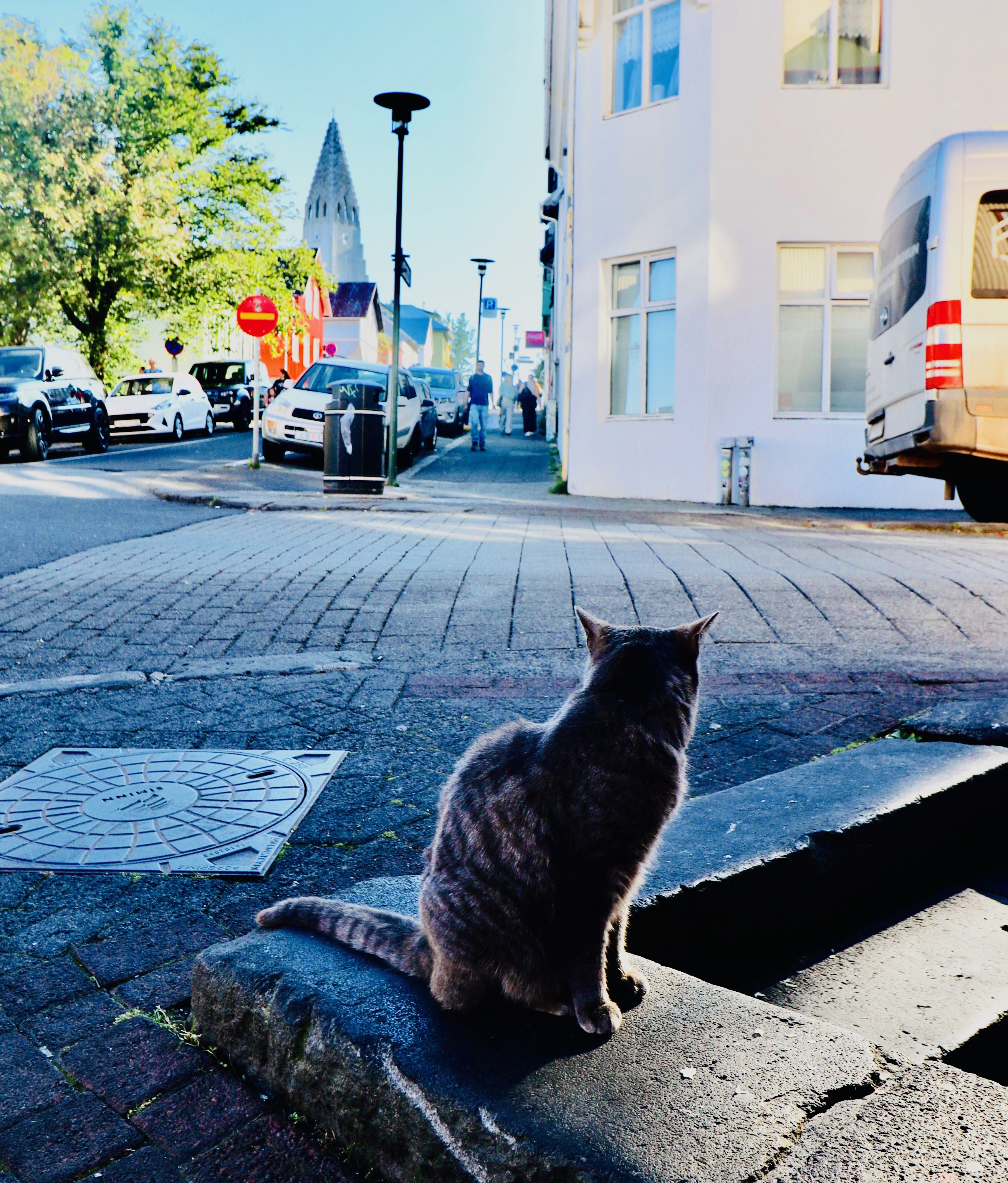
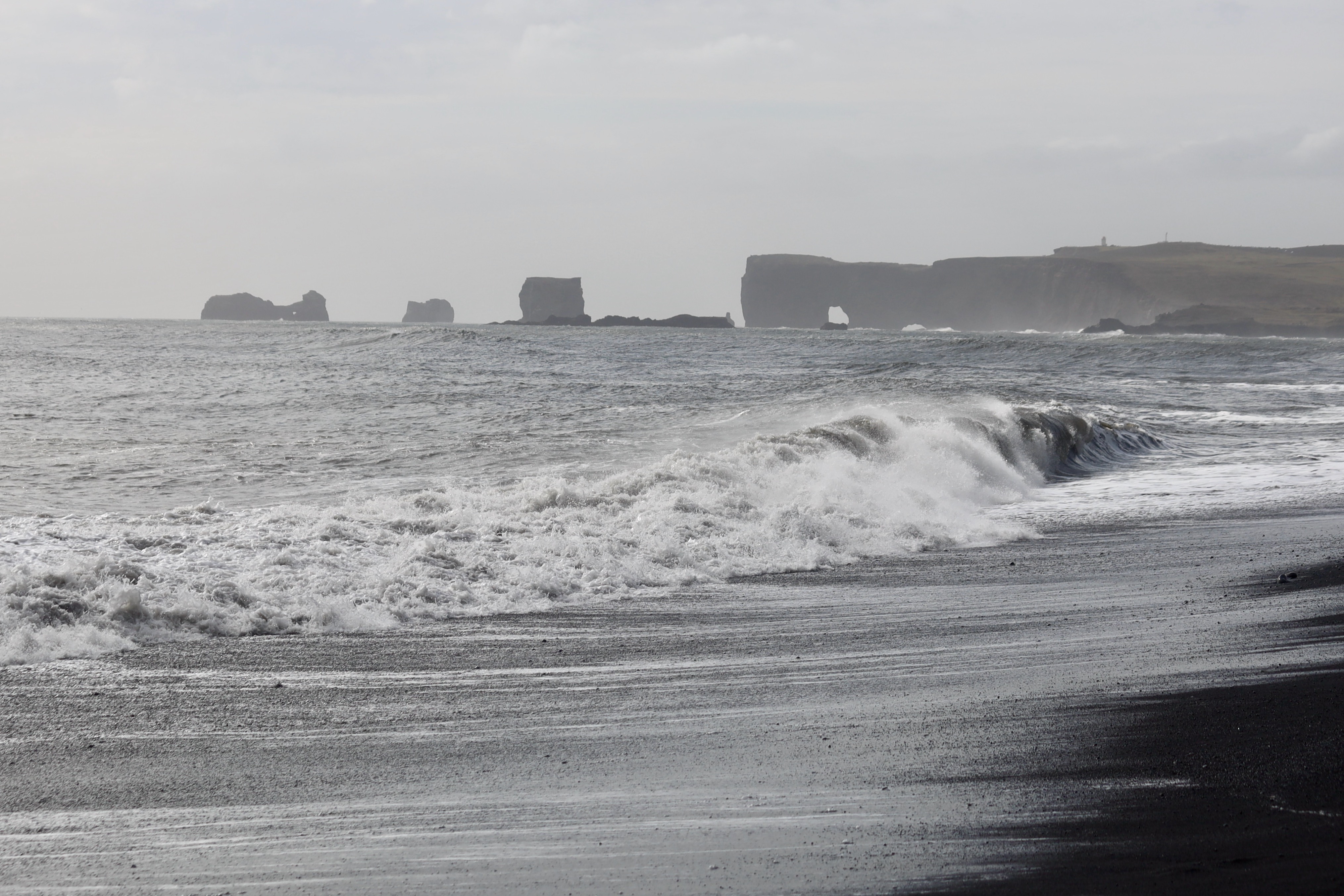
This picture that I took in Reykjavik really made me think of some kind of warm folk music:
These look like they belong on the cover of an acid rock album. Yes they are both mistakes I made with film. No these are not altered in any way digitally, I guess an homage to Hypgnosis:


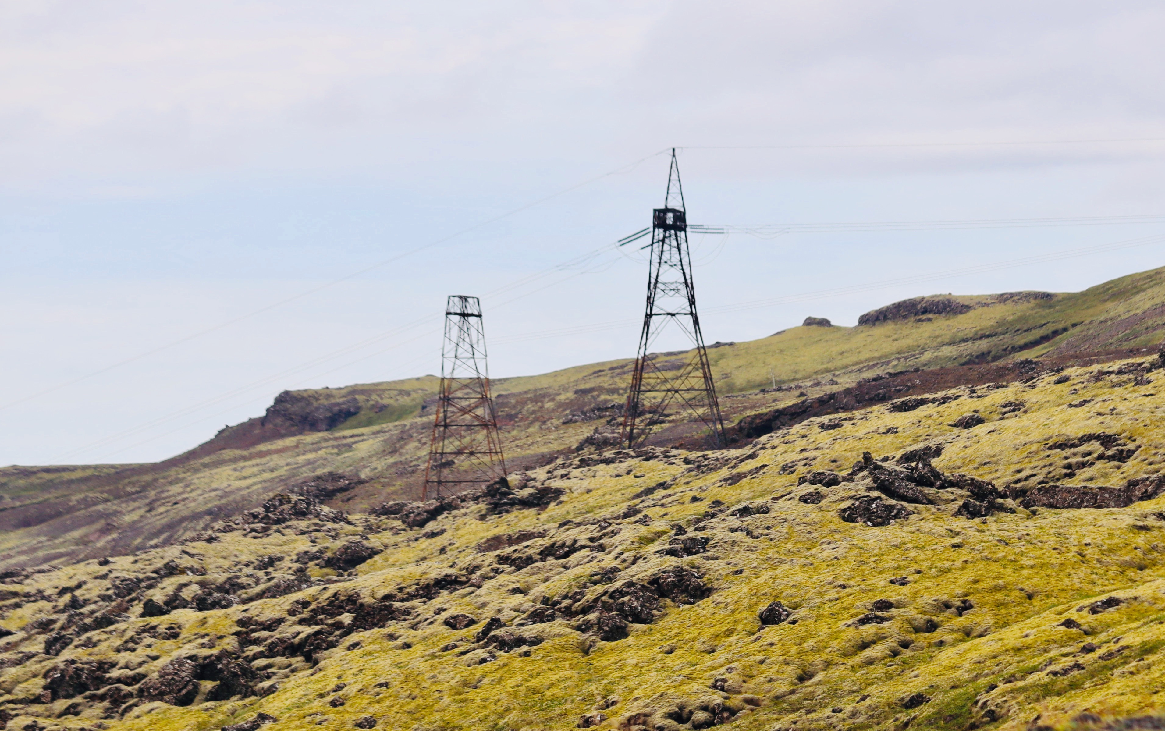
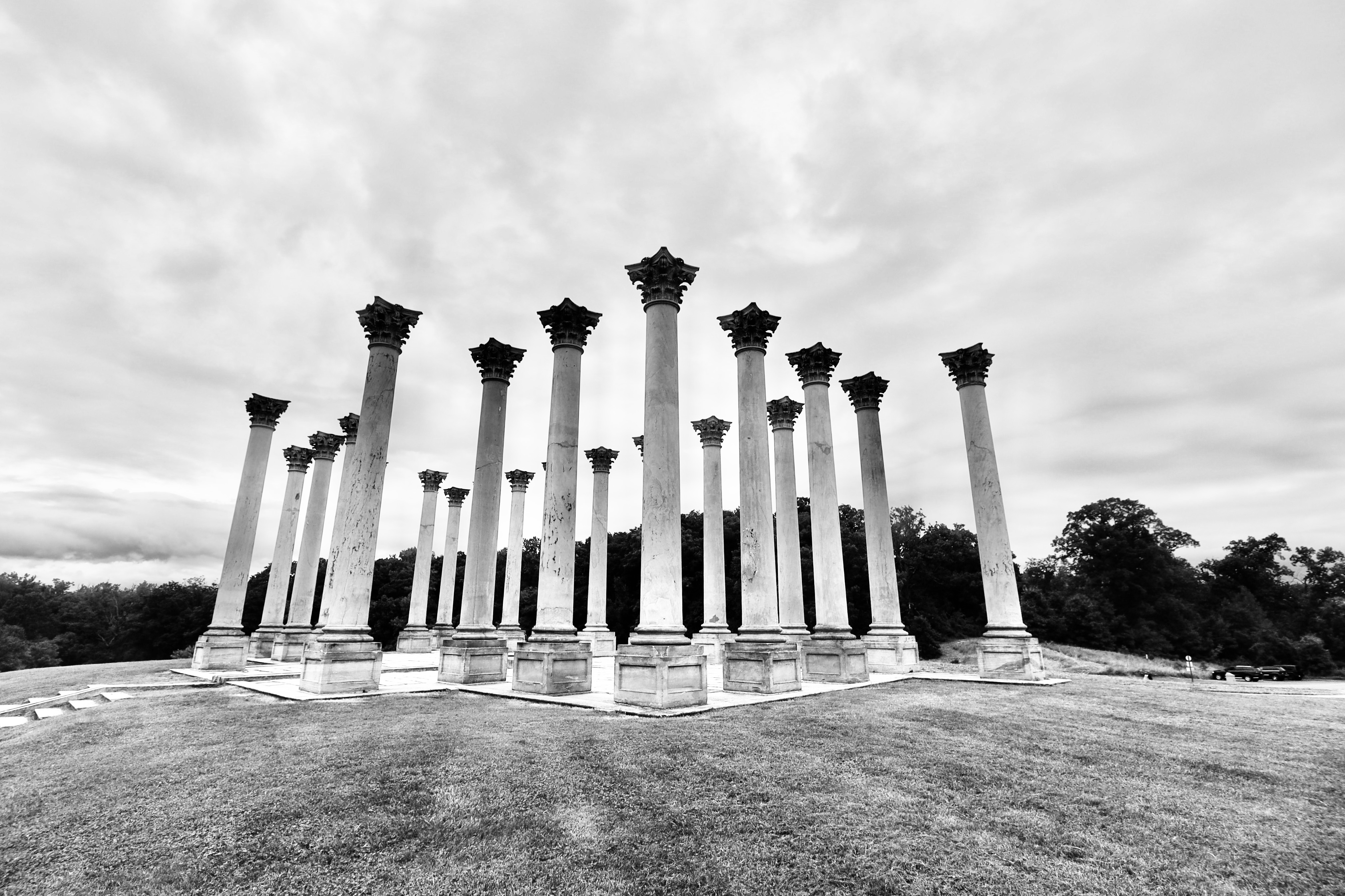
Iceland to me just looked like the cover of a Who album or maybe Led Zeppelin. Good album covers for complex, layered music:


This is the shot though that I like to call “The Icon.” Maybe this could be for a Greatest Hits album. It is that beautiful:

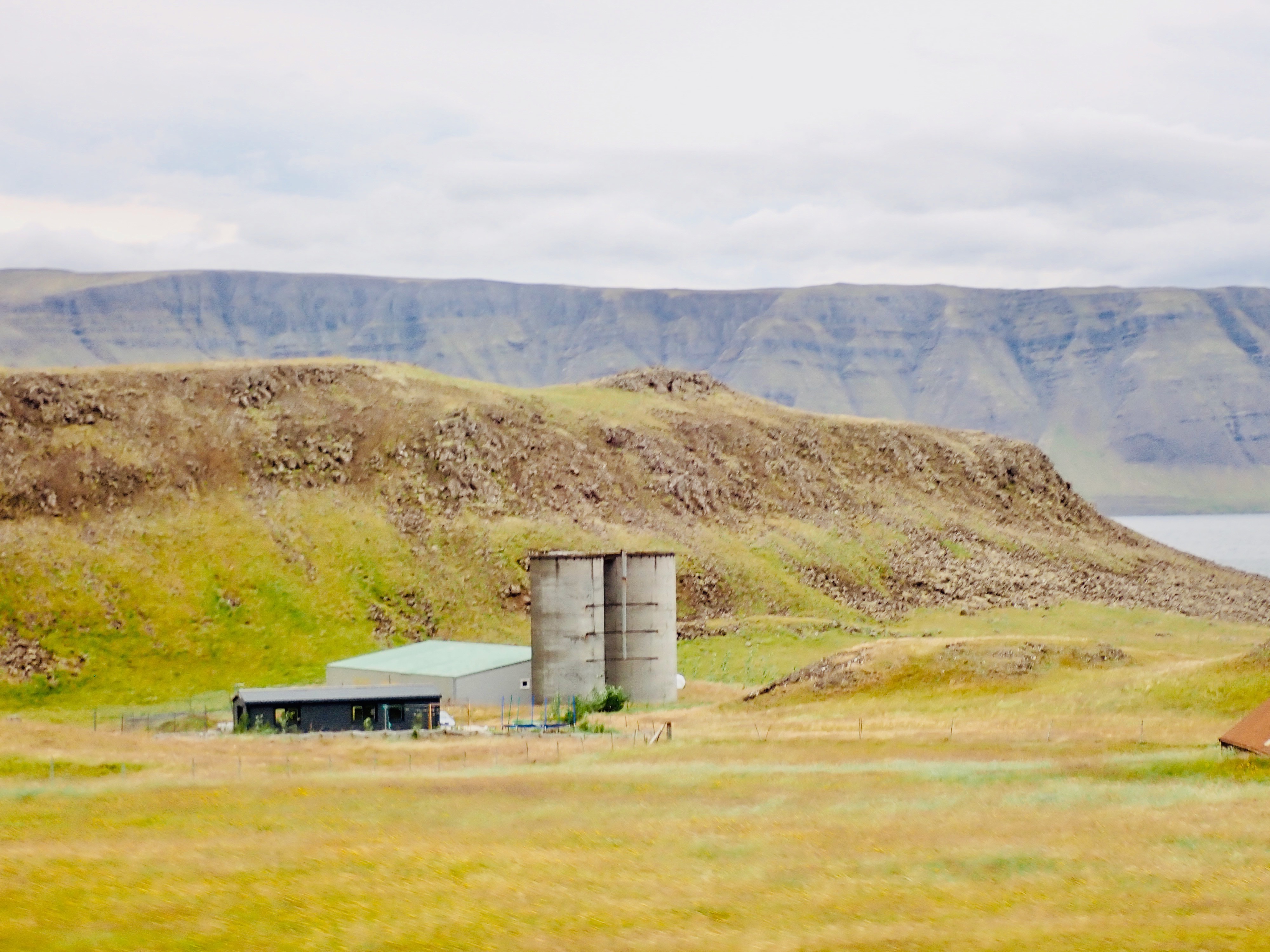
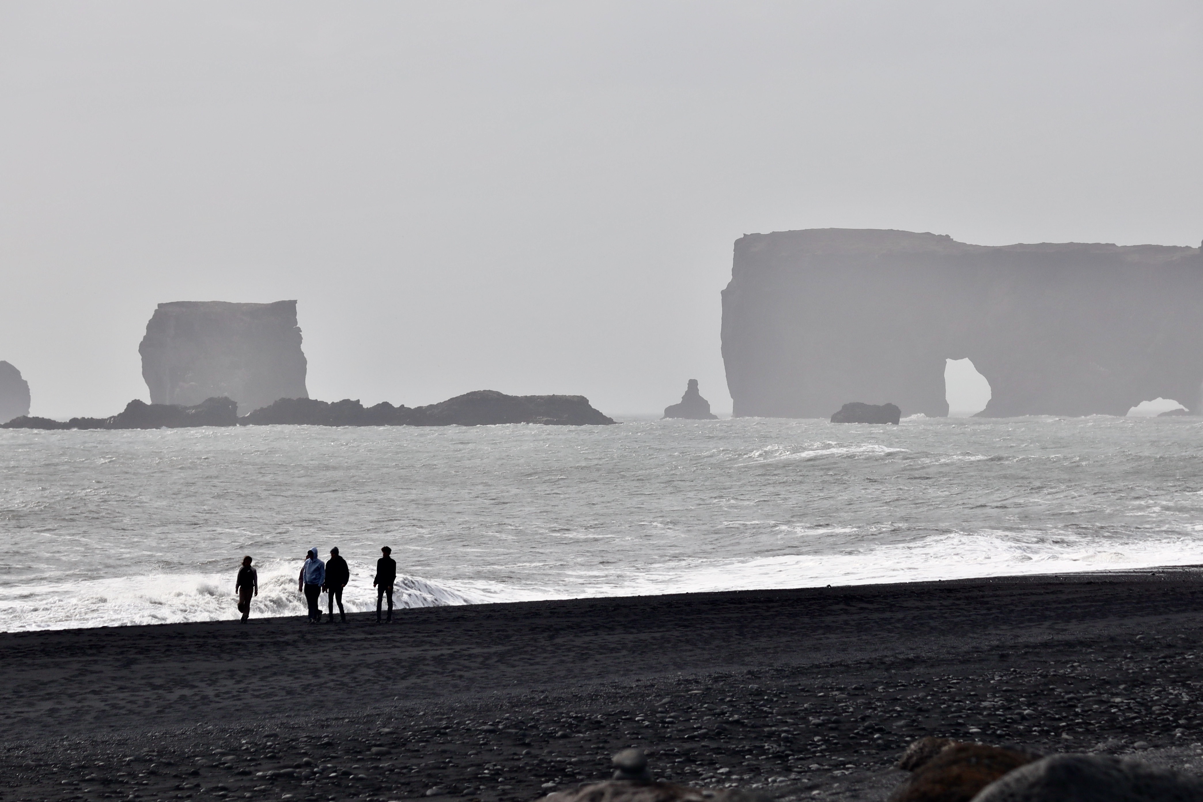
These two, both taken in Iceland, would fit well on the cover of an album by a sensitive alternative band:

This one, this definitely belongs on the cover a Jimmy Buffet type album, tropical ease:

These ones, they would go with albums that have music on them that is a bit strange for people’s tastes, a bit out there:

This one belongs on the cover of an album that is a bit happy and a bit sad at the same time:

This could be heavy metal:

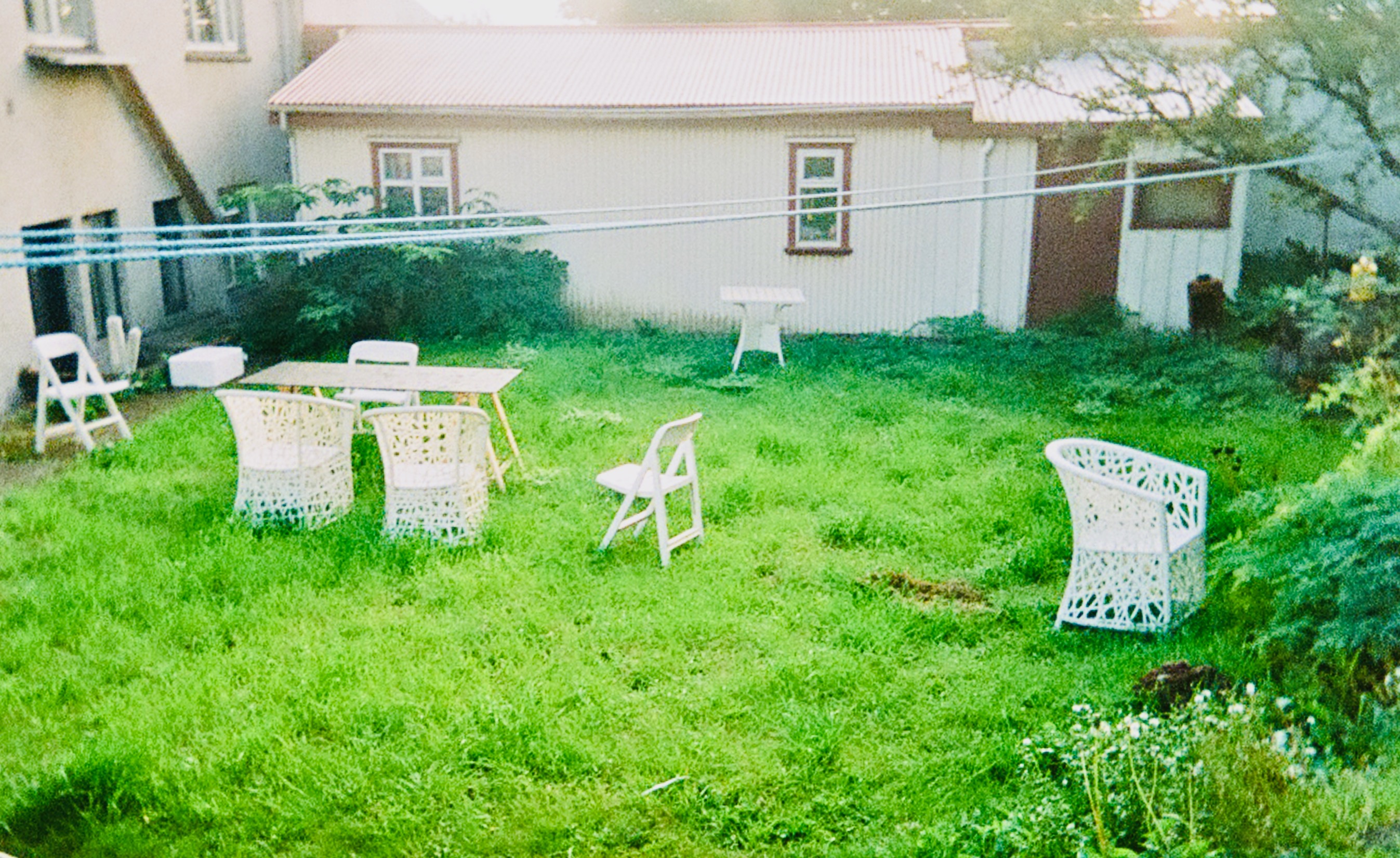
And last, but certainly not least, this one could definitely go on a comedy album or a band that has a comedic, offbeat feel. Where that communism at, Comrade Lenin says:

